

MirMir Organics
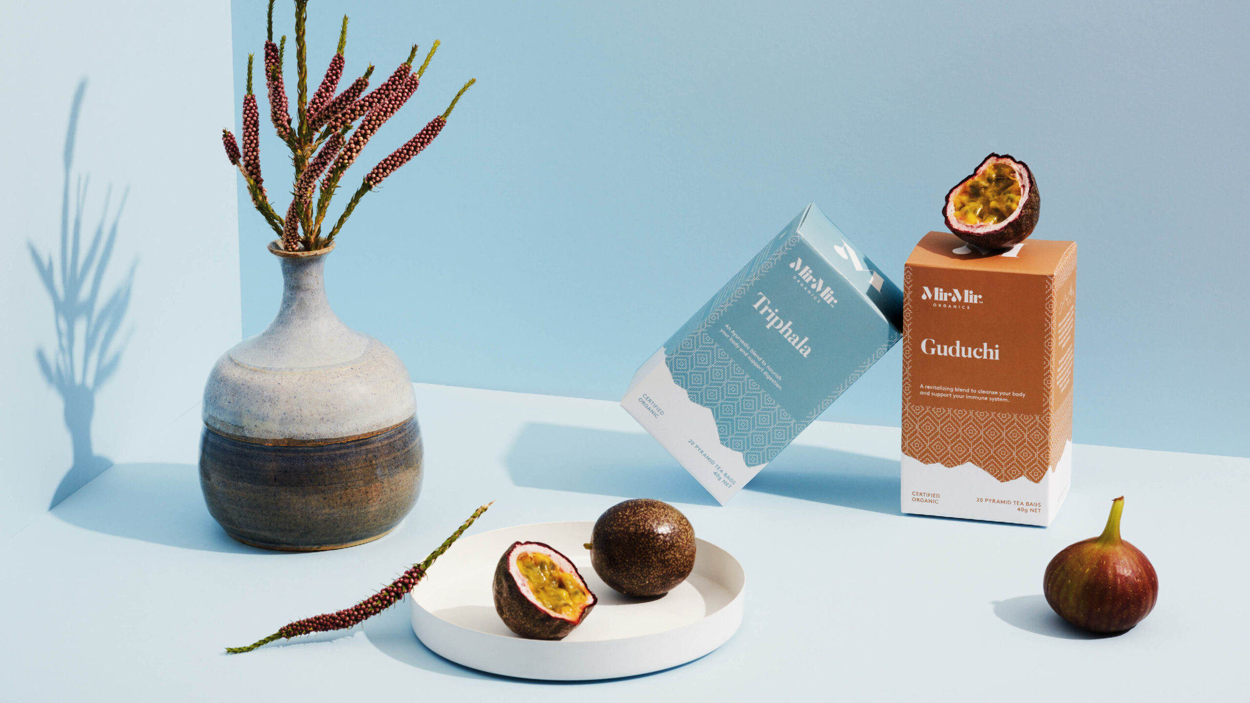
How do you realise the vision to bring amazing Nepalese herbal teas to the world? By giving them real meaning to their brand name and story; and encapsulating this visually in their brand.
What we did
- Art Direction
- Brand Strapline & Story
- Branding Identity
- Collateral
- Illustration
- Packaging


MirMir’s story began in Nepal where award-winning organic farmer Prem Lama had a vision to bring his amazing herbal teas to the world. Grown in pristine Himalayan soil, MirMir’s certified organic and wild crafted herbs are handpicked and harvested using traditional methods to ensure quality and flavour. MirMir means dawn. In Nepal, this is a sacred time as it’s the transition from night to day.


We wanted to encapsulate this visually in their brand. The droplet in the ‘M’ represents flowing tea but also the dew of dawn in the Himalayas. We also developed a pattern that we utilised across the packaging which is reminiscent of traditional Nepalese Dhaka fabrics.


